")
About Megadrive
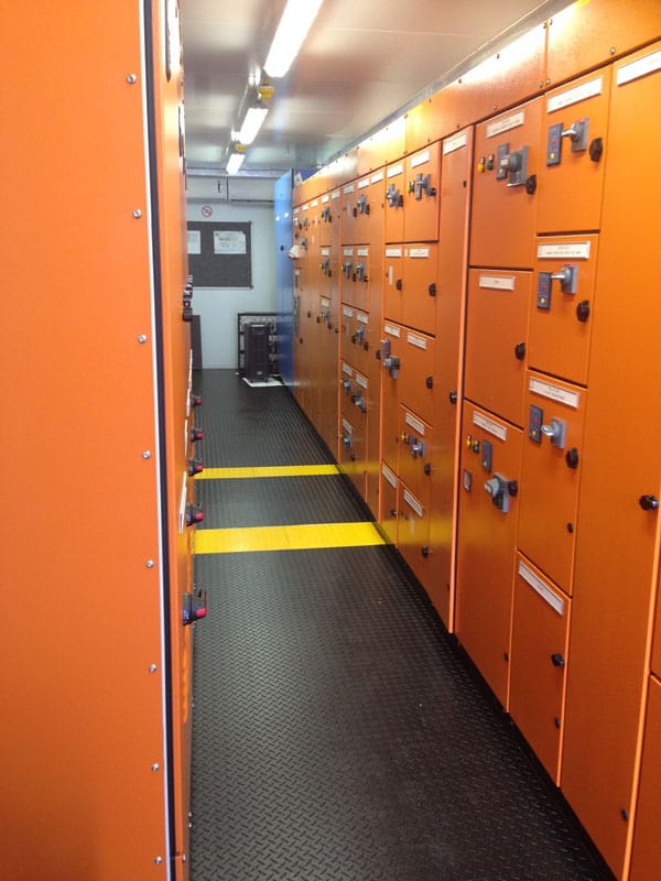
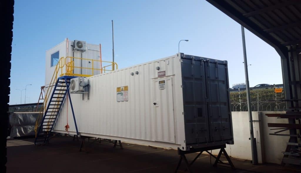
It was February 28th 1994 when Megadrive officially opened its doors. From humble beginnings in 250 m2 premises in Brackenfell, and 3 staff, Megadrive supplied Mitsubishi Electric Factory Automation products and support services. With a philosophy to ‘Never let the customer down’, it grew in size to cope with the ensuing customer demand for professional excellence, reliability and availability. It is now a 35-person strong company, and in 13000 m2. Megadrive is a specialist Electrical, Control and Instrumentation Design, build & supply company. We pride ourselves that we have the facilities and manpower to deliver a fully tested functional unit or project.
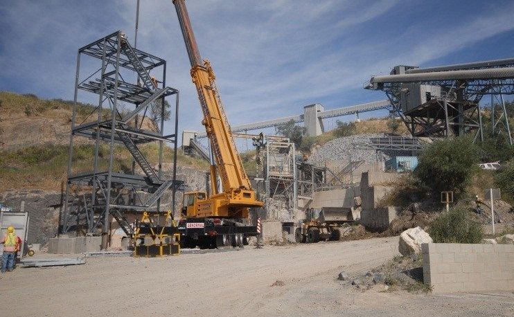
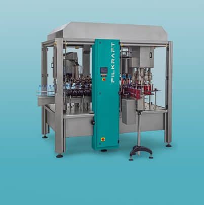
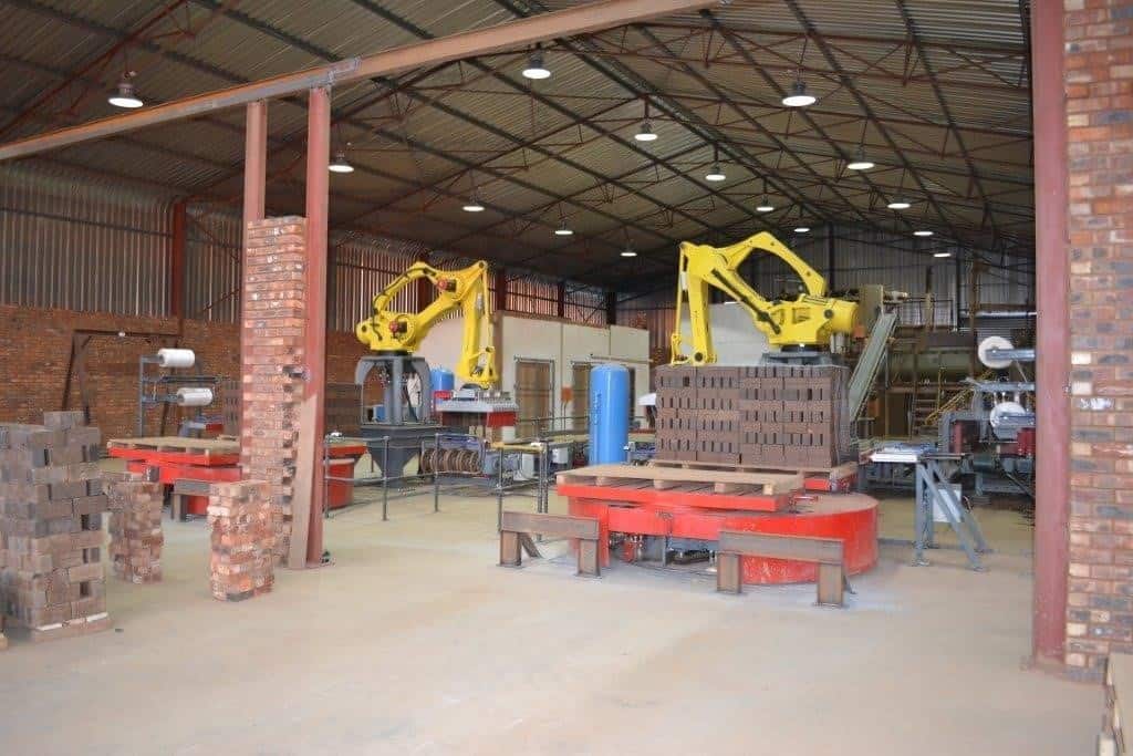
Our motto ‘Electrical Engineering for Plant & Process’ covers all industries from
Bricks to Bread, Propulsion to Plastics, and Coal to Diamonds.
Innovation
As Steve Jobs advises, ‘Innovation distinguishes between a leader and a follower.’, at Megadrive we constantly look for new ways to stay ahead.

vision
To be the best at what we do, for our clients, to keep them at the forefront of their industry in a time-sensitive and cost-effective way.

trust
At Megadrive, we know that without trust, you have nothing. With it, one can do great things. For 25 years trust has been at the core of our relationships with our clients, our suppliers and among ourselves.

quality
Our goal is to provide our clients with the highest quality in our products and services by assuring performance, consistency, safety, and value. This commitment is rooted in our corporate values and is essential to our continued growth and success